Tonight I spent a few hours tinkering with the colour management system and setting the grayscale. I’m quite pleased with the results. I’m still just under the 10H mark, so as the bulb ages a little, I do expect this will change.
For details on my setup and measurement process – check out the recent post on colour measurements.
This is my first attempt at doing a calibration on a digital projector, my past experience has been with CRT projectors which have used analog controls. The ability to have memories and recall alternate settings is very nice. This lets you experiment with abandon, as well as perform simple A/B comparisons of before and after.
Some of the feedback I saw on the AVSForum was that some folk had started to use the settings suggested in the projectorreviews.com write up on the 1080UB. Specifically, it was suggested that Theater Black 1, modified in the following manner:
Theatre Black 1, 6500K color temp, Offsets: Red – 2, Green 0, Blue 3. Gain: Red 2, Green 3, Blue 0. For viewing I normally had the Skin Tone setting at 3, or occasionally at 4. – Art Feierman
Now I may have missed something, but I didn’t see a description of adjusting the primary or secondary colours – which from my first set of measurements are clearly not right for REC601 (they may be closer to REC 709 for HDTV images).
However, there are several comments about eye-popping colour in the review – I can’t help but wonder if this is due to the not quite correct red and green. There is a disturbing trend in new displays supporting a larger colour gamut, and using it to differentiate themselves from other displays by using a non-standard (non-accurate) colour mapping.
Using Theater Black 1, I also noticed that both the blacks and the whites were crushed. This may have something to do with my signal path, but this is contrary to my observations with Theater Black 2 which seemed right on.
One DVD I’ve seen referenced in some reviews is The Thomas Crown Affair. The skin tones in this apparently show off the colour accuracy of a display. Having the ability to A/B my before and after made it very clear when looking at shots of Pierce Brosnan, pre-calibration he appeared a little sun burnt and post he looked much more natural. My initial impression is that colours seem a bit more muted than the default, but the image is still very engaging – and the Thomas Crown Affair completely sold me on the post-calibration setting being much more correct.
This was more a learning experience. I’m still running in a very temporary mode with some cheap component cables and my old Sony player. The Oppo 980 arrived this week, but I’m still waiting on the HDMI cables before I can get it setup.
Folks interested in my actual settings and some pretty pictures, read on..
These settings are probably completely useless to anyone, as it appears that each 1080UB is unique. The settings posted by Art Feierman would not result in any significant improvement in my situation (I checked)
I started with Theater Black 1:
Brightness 2 (raised this from 0 to fix black crush)
Contrast -2 (lowered this from 0 to fix white crush)
Color Saturation -2 (default)
Tint 2 (default)
Sharpness Standard
Abs. Color Temp 6500
Brightness Control Low
Auto Iris Off
[drat – I missed recording skin tone, but I left it at default too]
With this setting – I measured and got the following graphs
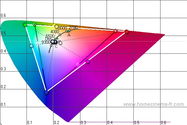
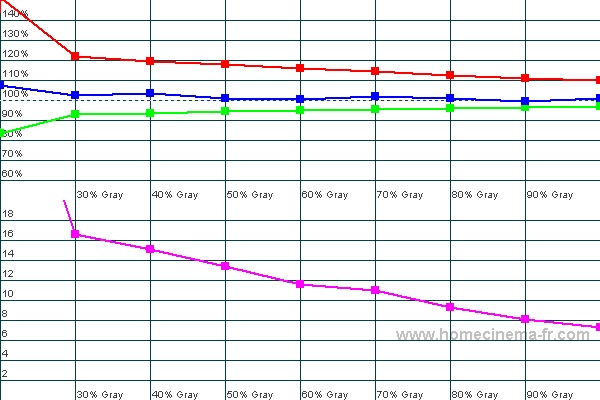
The CIE graph is nearly the same as the previous ones I created: red, green and magenta all need a bit of help. The RGB graph shows we’ve got too much red, and not enough green. The purple line is the dE and represents the colour temperature error (from 6500k), the dE isn’t very good in this graph.
Under the advanced menu – I made the following changes :
RGB Adjustments
Offset R -8
Offset G 4
Offset B -2
Gain R -7
Gain G 4
Gain B 0
RGBCMY (hue, sat, bright)
R 16, -39, 0
G -60, -48, 0
B 0, 0, 0
C 0, -64, 0
M -18, -34, 0
Y 0, 0, 0
These changes got me the following graphs:
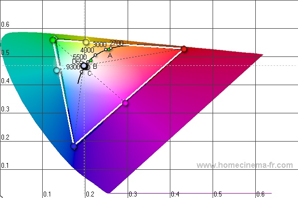
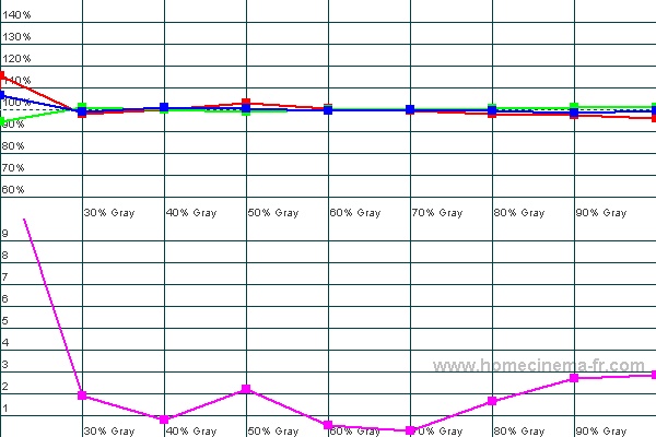
I wasn’t able to get green or cyan exactly correct, but they are fairly close. The RGB is much better, and the dE looks pretty good.
I think this has proven two things:
1) Every 1080UB will have different calibration needs/settings
2) The available controls are sufficient to achieve colour accuracy
Now I should stop measuring/fussing with this thing and watch some movies.
You should come calibrate the TV I have at home, the colour is way out of wack. The best I could do is play a DVD on my computer and try to match the colours between the both of them. The saturation was waaaaaaaaayyy up.