 Since February my phone has been the Nexus One. When I got it I wrote up a brief review where I compared it to the iPhone 3G and the HTC G1, so I guess this is a sort of exit review for the Nexus One as my new phone is the HTC Desire (also known as the Bravo or A8181).
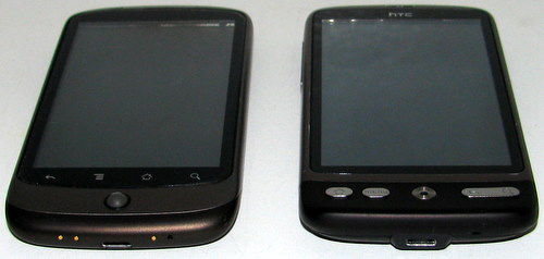
The HTC Desire is almost the same hardware as the Nexus One. The wikipedia page has a good feature comparison so I’ll try avoid going over that ground. You can see from the photo at the top of this post that they share pretty much the same form factor. The Desire has a little bit of the HTC chin design where the Nexus did not. The Nexus notably has the three brass dots for the docking station which the Desire does not.
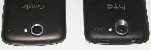
Looking at the back, things are pretty much identical. The Nexus One has a band of exposed aluminum frame (which can host an engraving), and the power button is slightly different likely due to the small difference in back cover design. The size, general shape, and weight of the phones are basically identical. I do notice that the Desire feels ‘flatter’ for some reason, and it almost feels as if it is a slightly more refined phone.
The Desire has a Super LCD vs the Nexus AMOLED. There is a visible difference here, and one that sticks in my head. In day to day use it isn’t bothersome, but more than just a subtle difference. The Super LCD tends to have washed out blacks, and appears a little bit dimmer to my eye. In every other aspect the two displays are equivalent, enough to make the differences a non-issue for day to day use. The Desire has a gorilla glass screen, where the Nexus did not.
The dock was a nice feature on the Nexus, just drop it in and it charged. I rarely plugged it into a microUSB connector. However the dock also discouraged the use of any sort of bumper case for the Nexus, I’ve got a case on order for the Desire already.
So while these two phones are quite similar, the button layout is not. Let’s compare the HTC G1 (top), Nexus One (middle), and HTC Desire (bottom):
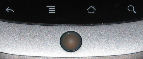
The G1 actually had buttons dedicated to phone functions, it also had 5 function buttons vs. 4 in the later phone. The Nexus had touch sensitive buttons, which took some getting used to after having real buttons. The track ball was transparent and allowed for coloured notifications. The Desire swaps the track ball for an optical track-pad, some people really dislike this but I haven’t found it to be a problem. The back and search button is a rocker, effectively working as independent buttons.
Looking across the layouts, the home button has wandered around in different locations for every one. Search and menu are fairly consistent, but I’m not sure it helps much. Layout changes like this really mess with your head/muscle memory.
In stock form there are bigger differences between the two devices. However, both are fairly friendly to root and flash with your favorite community ROM. I’ve been running CyanogenMod since I got the G1 and continue to do so with the Desire.
Looking at the internal storage is where we notice some big differences. Nexus One: 196MB, Desire: 148MB. Having come from the Nexus meant that I very quickly started to hit out of storage problems, forcing me to move more of my apps to the SD Card. Everything fits without resorting to apps2sd or other hacks.
Speaking of hacks, you can change this if you are willing to flash a new HBOOT – this is of course somewhat scary as messing up HBOOT may be difficult to recover from. It also requires the phone be in S-OFF (developer) mode, allowing modification of /system while Android is running. Contrary to most of the material out there you can run in S-ON mode and have custom firmware, there are some limitations but no deal breakers (my Desire is currently S-ON).


