My brother in-law’s BlackBerry 9700 suffered a new problem this time JVM Error 102. A quick google search turns up more 600,000 results – so this is I assume a pretty common problem. In his case it seems entirely random – he had it plugged in to charge and when he went to unplug it, it was stuck on an all white screen with JVM Error 102 with one choice: reboot. It seemed the device was stuck in a reboot cycle, always hitting the same error.
I followed the instructions on this page, but I’ll also repeat them here to cover exactly what I did. Sadly this requires a Windows machine (I used XP).
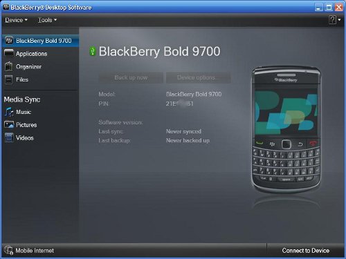
If you don’t already have the BlackBerry Desktop Software installed and running, you’ll need that. If you’ve never had the BlackBerry connected to your Windows machine, it may also need to install some USB drivers, my Windows XP was able to figure out what was needed automatically. Hopefully you’ll be in a state as shown in the picture at the top of this post, able to see the device but not able to do anything.
Now you need the JL_cmder utility. The utility is just a script driving the JavaLoader program. With the BlackBerry Desktop Software running, also run this script. If you are having trouble with this part, I’d advise you to stop trying to solve this yourself and get some help. You’ll need to be comfortable with command line programs to succeed.
If you see some output like the following when using JL_cmder:
RIM Wireless Handheld Java Loader

Copyright 2001-2007 Research In Motion Limited

Connecting to device...debug: HRESULT error dur

ing Open: 80040154

Error: unable to open port
Then you’ve probably failed as I had to install the BlackBerry Desktop Software, or it isn’t running, or you’ve got a driver problem, or maybe there is a more serious problem with your BlackBerry. Once I had installed and was running the BlackBerry Desktop Software this problem went away for me.
Now you want to grab the eventlog. This will open a notepad with the contents of your log. In my case there had been many failed boots, so the error was repeated many times. Here is the last complete entry:
guid:0x97C9F5F641D25E5F time: Wed Dec 31 19:00:00 1969 severity:0 type:2 app:System data:System Startup

guid:0x97C9F5F641D25E5F time: Wed Dec 31 19:00:00 1969 severity:0 type:2 app:System data:VM:FSNHv=1

guid:0x97C9F5F641D25E5F time: Wed Dec 31 19:00:00 1969 severity:0 type:2 app:System data:VM:CVER=5.0.0.351

guid:0x97C9F5F641D25E5F time: Wed Dec 31 19:00:00 1969 severity:0 type:2 app:System data:VM:PSIDv=266951

guid:0x97C9F5F641D25E5F time: Wed Dec 31 19:00:00 1969 severity:0 type:2 app:System data:CMM: verifyHash failed for net_rim_device_apps_games_wordmole_graphics_480x360-6(3437)

guid:0x97C9F5F641D25E5F time: Wed Dec 31 19:00:00 1969 severity:0 type:2 app:System data:VM:+BORK

guid:0x97C9F5F641D25E5F time: Wed Dec 31 19:00:00 1969 severity:0 type:2 app:System data:JVM Error 102

guid:0x97C9F5F641D25E5F time: Wed Dec 31 19:00:00 1969 severity:0 type:2 app:System data:Invalid code in filesystem

guid:0x97C9F5F641D25E5F time: Wed Dec 31 19:00:00 1969 severity:0 type:2 app:System data:JVM:INFOp=21e0b6b1,a='5.0.0.351',o='5.1.0.98',h=4001507
You can see there is a verifyHash failure in the log, I’ve marked the file name of the offending file in bold (your log won’t have the bold marking in it – that’s your job, to identify the problematic file). So there isn’t any good reason this file was corrupted and not another, but luckily it is clearly a non-critical file. I was amused by the appearance of the Unix epoc in the log file.
Now that we know what the problem is, we’ll just remove the file. I’ll stress that the filename is going to be unique to your problem. Reading the error log is a critical step. Using a command shell we’ll execute the following:
JavaLoader.exe -u erase -f net_rim_device_apps_games_wordmole_graphics_480x360-6
Doing this caused the device to reboot. If it doesn’t reboot on it’s own, you might need to manually reboot/reset the device. That’s it you’re done – you should have a working BlackBerry at this point.
Follow up steps – you should synchronize with the desktop software to back up your device. It may be wise to push a firmware upgrade to the device, even the same version you had (assuming you were fully up to date) – this will replace all other files which may have been corrupted. I didn’t do this, but I’d hope the desktop software makes this a straight-forward process.

